The psychology of almost clicking
Analytics count what people do. The more interesting story is often in what they nearly did.
Every product dashboard I have worked with is built around completed actions. Clicks, sign-ups, purchases, sends. When someone doesn’t finish, they drop out of the funnel and become a percentage: 38% abandoned at step three. The number tells you that something happened. It doesn’t tell you what.
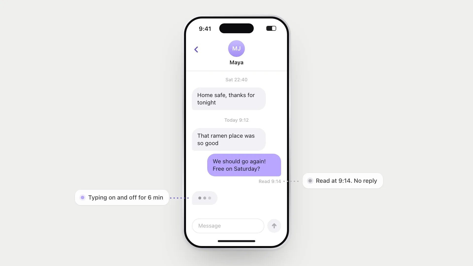
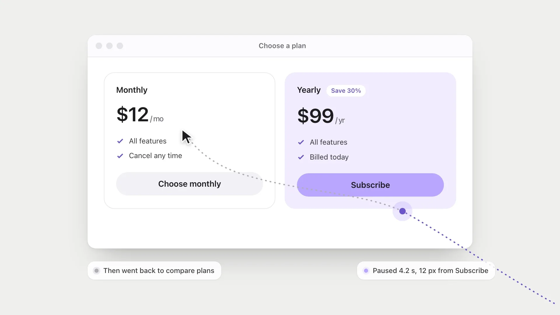
But people rarely leave a screen without a trace. The cursor drifts toward the button and stops. A message gets typed, read back, and deleted. A plan is picked, then the comparison table is opened again. These moments are small, but they are some of the most honest data a product ever gets, because nobody performs hesitation on purpose.
They’re also easy to misread. A pause can mean confusion, doubt, interest or nothing at all. So I want to look at what the research actually says hesitation reveals, where that evidence is weaker than it sounds, and what it means for design, including the uncomfortable question of how much of it a product should be watching.
Hesitation is a kind of answer
Psychologists have used hand and mouse movement as a window into decisions for years. The idea rests on a simple observation: people often start moving before they’ve finished deciding. If the decision is still being made while the hand is travelling, the path should show it.
Michael Spivey, Marc Grosjean and Günther Knoblich gave a clear demonstration. People heard a word, such as “candle”, and moved the mouse to the matching picture. When one of the other pictures had a name that sounded similar, like candy, the cursor curved toward it on the way on its way to the right picture. For a fraction of a second, both words were live in the listener’s mind, and the hand was pulled between them.
Jonathan Freeman and Nalini Ambady later built MouseTracker, software that made this method easy to use, and it has since been applied to all kinds of choices. The pattern is the same: a straight line means a clear decision. A curve that bends toward the other choice means conflict, even when the final click looks the same in the data.
That last part is the point for designers. Two people who both clicked “Subscribe” can have had completely different experiences of the decision. One was sure. The other nearly didn’t. A conversion count treats them as identical.
Why the lab is cleaner than your product
Before getting carried away, it’s worth being honest about a limit. Mouse-tracking experiments are carefully designed to make thinking leak into movement. Stefan Scherbaum and Pascal Kieslich showed how much this matters. When participants had to start moving the mouse to make the choice appear, the continuous traces of the decision were clear. When the choice simply appeared and people could start moving whenever they liked, those traces were weaker and less consistent, because people tended to decide first and move afterwards.
Real products are much more like the second setup. Nobody is required to start moving before they’ve made up their mind. People rest their hand, scroll with a trackpad, read with the cursor parked in a corner. On a phone there’s no cursor at all. So a single cursor path from a real session is a noisy hint, not a readout of someone’s mind.
Web researchers ran into the same problem and found a useful way through it. Jeff Huang, Ryen White and Susan Dumais studied cursor movement on search result pages at scale. They found that cursor position was closely related to where people were looking, especially on those pages, and that cursor data could help tell “good” abandonment, where someone found the answer in the snippet and left happy, from “bad” abandonment, where they gave up. “No click” turned out to be several different things.
A year later, Huang, White and Georg Buscher complicated their own finding. Gaze and cursor were not always aligned. It depended on what the person was doing, whether reading, hesitating, scrolling or clicking, and on the person and the task. They questioned the common assumption that the cursor is a good stand-in for the eyes. I find this kind of self-correction reassuring. The lesson isn’t that cursor data is useless. It’s that it becomes meaningful in patterns across many sessions, and much less so in any single one.
So an unclicked button isn’t empty data. It’s a question the person was asked and didn’t answer yet. The useful thing for a designer is to work out which question.
Four kinds of almost
When I look at sessions where someone stalls, I tend to sort the hesitation into four groups. Each one needs a different response, and treating them as the same thing is how products end up nagging people.
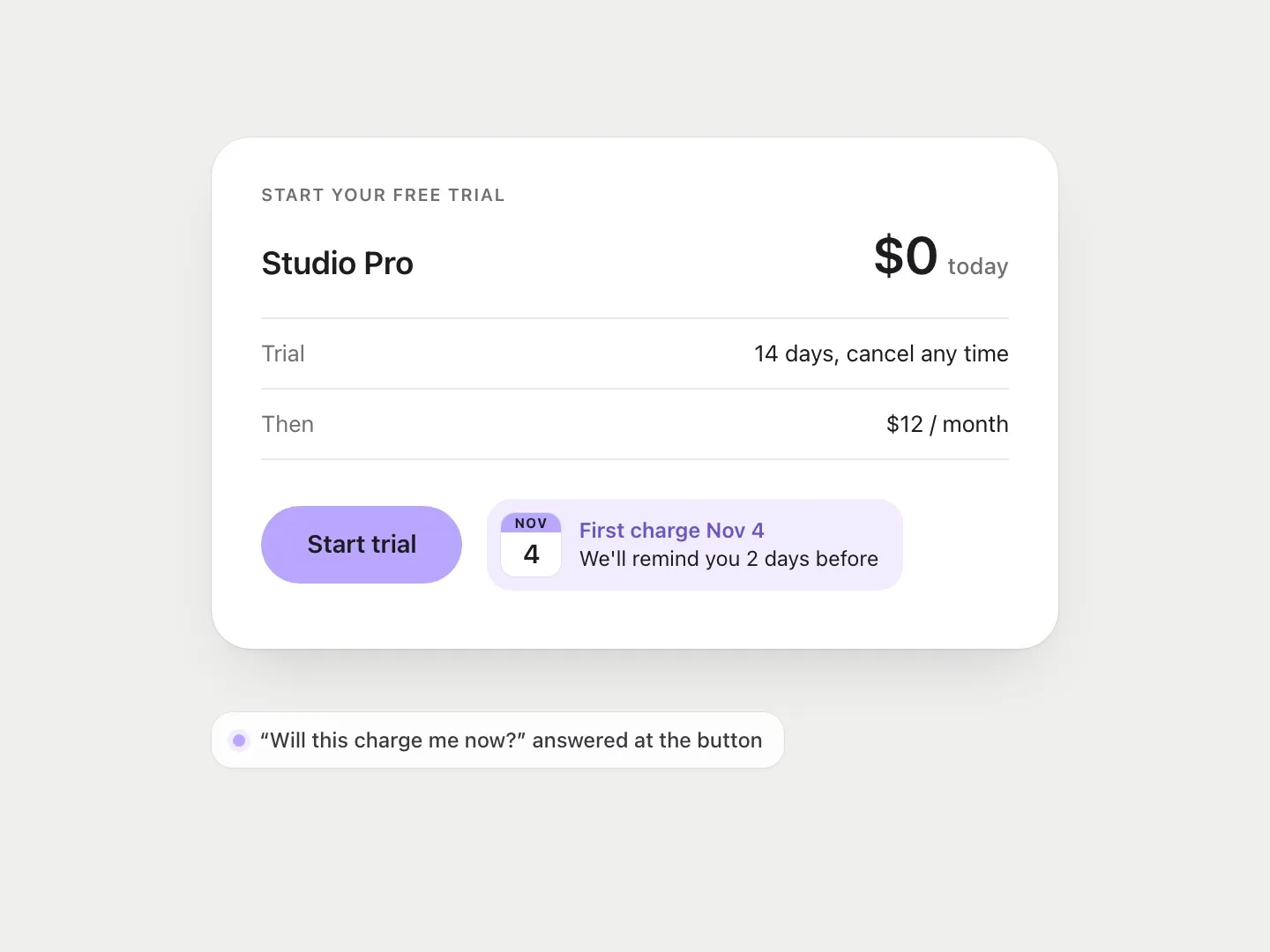
- Not sure what will happen. The person wants to do the thing but can’t predict the result. Will this charge me now? Will they see I viewed their profile? The fix is information, placed at the moment of doubt, not in a help centre.
- Not sure it’s worth it. They understand the action and are weighing it. Here the job is to make the trade-off easy to see, and then leave them alone.
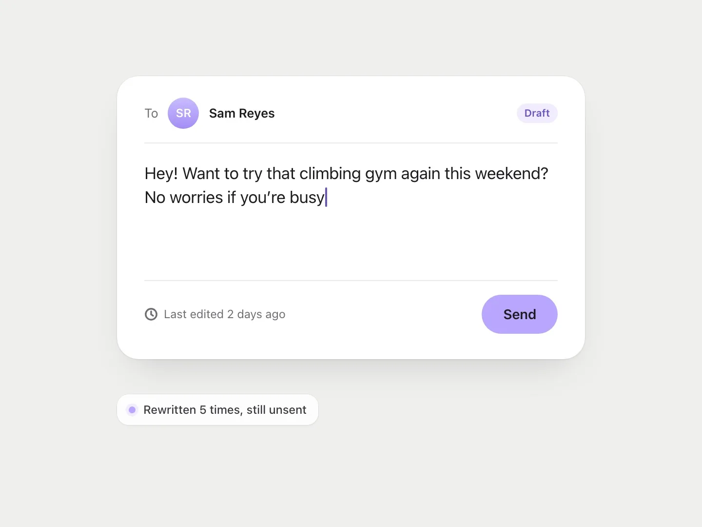
- Not sure about themselves. This is the message typed and deleted. The hesitation isn’t about the interface at all. It’s social risk.
- Not ready yet. They’ll be back. Pushing here usually just converts “later” into “never”.
The second group has the best-studied mechanism. Amos Tversky and Eldar Shafir showed that when a choice involves conflict, people are more likely to put it off, look for something else, or fall back on the default. Strikingly, this can happen when the options get better. Adding a second attractive option can make people less likely to choose either, because now there’s a trade-off to resolve. Hesitation here isn’t a lack of interest. It’s the cost of comparing.
This is often summarised as “too many choices paralyse people”, usually with a story about jam. I’d be careful with that version. Benjamin Scheibehenne, Rainer Greifeneder and Peter Todd pooled 50 experiments on choice overload and found an average effect of virtually zero, with large differences between studies. Sometimes more options put people off. Often they don’t, and sometimes they help. The number of options isn’t the problem on its own. What seems to matter is how hard the options are to compare.
That changes the design response. Cutting the plans from four to three won’t help much if the three are still hard to tell apart. Making the one real difference between them obvious might.
The deleted message problem
The third group is the one I find hardest and most interesting. In a 2013 study, Sauvik Das and Adam Kramer at Facebook looked at what they called last-minute self-censorship: posts and comments that were written and then not shared. Across 3.9 million users over 17 days, 71% did this at least once. Posts were held back more often than comments, and status updates and posts to groups most of all. The authors read this as evidence that the problem is the perceived audience. Comments reply to a known person. A status update goes to a crowd you have to imagine.
A smaller interview study by Manya Sleeper and colleagues asked people to keep track of everything they thought about posting and didn’t. Participants said they would have shared about half of that unshared content if they could have chosen exactly who saw it.
That says something about the interface, not only about the people. If you can’t tell who will read what you write, every post is a guess about a crowd. Hesitation goes up because the product has made the social situation unclear. When I worked on Ditto, an app for making plans with friends, this was the moment that mattered most: the second invitation, typed and left unsent, because nobody wants to look keen.
The design response wasn’t to push harder. It was to lower the cost of being turned down, so the message felt less like a test.
It’s worth noticing that not all self-censorship is a problem to fix. Some of those deleted posts were probably better left unsent. Yang Wang and colleagues tested two small changes to Facebook in a six-week field trial with 28 people: a reminder of who would see a post, and a short delay before it was published. The audience reminder helped prevent posts people might regret without much burden. The delay was seen as both useful and annoying. The aim isn’t to get everyone to send more. It’s to make sure that when they do hold back, it’s because they decided to, not because the interface left them guessing.
Reading hesitation without spying on it
There’s an obvious problem here. Watching what someone almost did is close to watching what they chose not to share. A product that logs your deleted drafts has crossed a line, whatever it plans to do with them. And the research that makes hesitation interesting is the same research that shows how revealing it is. If a cursor path can show conflict a person never voiced, then collecting it is collecting something they never chose to tell you.
I think the answer is to treat hesitation as a signal about the design, not about the person. A few rules I try to keep:
- Study it in aggregate and in research sessions, where people know they’re being observed and can talk you through the pause.
- Never store unsent content. What someone deleted should stay deleted.
- Respond to hesitation inside the product only with things that help everyone, like clearer labels or a visible undo, never with targeted pressure such as a sudden discount pop-up.
The last rule matters for a practical reason as well as an ethical one. Individual cursor paths are noisy, so a pop-up triggered by one person’s pause will often fire on the wrong people: the ones who were reading, or had looked away. Aggregate patterns are where this data is reliable, and they point at fixing the screen, not chasing the person.
The aim isn’t to catch people before they leave. It’s to make the decision clear enough that they don’t need to hesitate.
Designing for the pause
Once you start seeing hesitation as information, a few patterns become obvious. Put consequences next to the button, not behind it. Make actions reversible so the stakes of clicking drop. Give people a soft version of the commitment, like saving a draft or adding to a list, so “not yet” has somewhere to go. Make the audience visible wherever something is shared. And when options are close, make the real difference between them easy to see.
And in research, ask about the pause directly. “You stopped there for a moment. What were you thinking?” is one of the most useful questions in usability testing. The answer is almost never “nothing”.
A completed click tells you the design worked. An almost-click tells you where it nearly didn’t, and that’s usually where the next improvement is.
References
10
- Das, S. & Kramer, A. (2013). Self-censorship on Facebook. Proceedings of the International AAAI Conference on Web and Social Media (ICWSM), 7(1), 120–127. doi.org/10.1609/icwsm.v7i1.14412
- Freeman, J. B. & Ambady, N. (2010). MouseTracker: Software for studying real-time mental processing using a computer mouse-tracking method. Behavior Research Methods, 42(1), 226–241. doi.org/10.3758/BRM.42.1.226
- Huang, J., White, R. W. & Buscher, G. (2012). User see, user point: Gaze and cursor alignment in web search. In Proceedings of CHI 2012 (pp. 1341–1350). ACM. doi.org/10.1145/2207676.2208591
- Huang, J., White, R. W. & Dumais, S. (2011). No clicks, no problem: Using cursor movements to understand and improve search. In Proceedings of CHI 2011 (pp. 1225–1234). ACM. doi.org/10.1145/1978942.1979125
- Scheibehenne, B., Greifeneder, R. & Todd, P. M. (2010). Can there ever be too many options? A meta-analytic review of choice overload. Journal of Consumer Research, 37(3), 409–425. doi.org/10.1086/651235
- Scherbaum, S. & Kieslich, P. J. (2018). Stuck at the starting line: How the starting procedure influences mouse-tracking data. Behavior Research Methods, 50(5), 2097–2110. doi.org/10.3758/s13428-017-0977-4
- Sleeper, M., Balebako, R., Das, S., McConahy, A. L., Wiese, J. & Cranor, L. F. (2013). The post that wasn’t: Exploring self-censorship on Facebook. In Proceedings of CSCW 2013 (pp. 793–802). ACM. doi.org/10.1145/2441776.2441865
- Spivey, M. J., Grosjean, M. & Knoblich, G. (2005). Continuous attraction toward phonological competitors. Proceedings of the National Academy of Sciences, 102(29), 10393–10398. doi.org/10.1073/pnas.0503903102
- Tversky, A. & Shafir, E. (1992). Choice under conflict: The dynamics of deferred decision. Psychological Science, 3(6), 358–361. doi.org/10.1111/j.1467-9280.1992.tb00047.x
- Wang, Y., Leon, P. G., Acquisti, A., Cranor, L. F., Forget, A. & Sadeh, N. (2014). A field trial of privacy nudges for Facebook. In Proceedings of CHI 2014 (pp. 2367–2376). ACM. doi.org/10.1145/2556288.2557413