The beauty of useful imperfection
When every interface follows the same rules perfectly, they start to look the same. A little imperfection, placed with care, is how a product becomes recognisable.
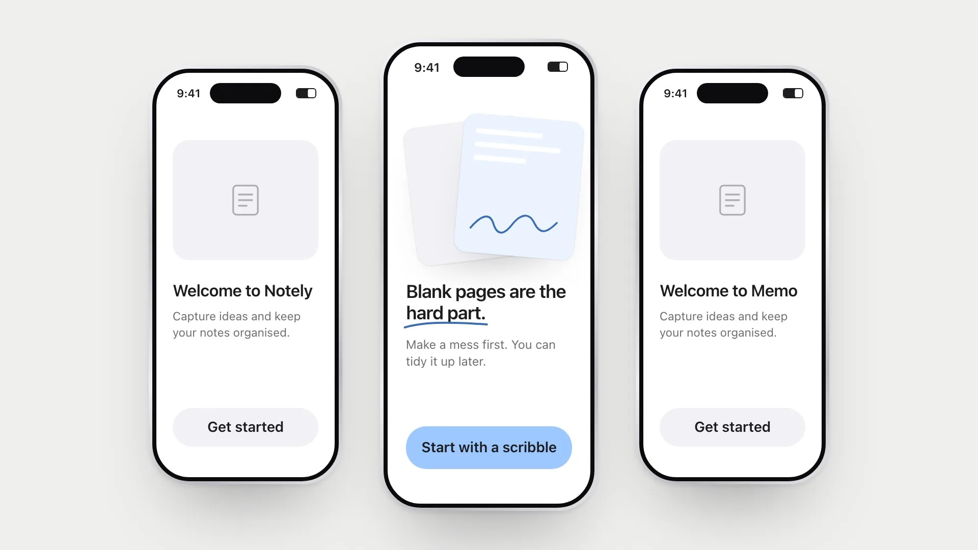
Open five new apps and you’ll often see the same thing: the same rounded cards, the same sans-serif, the same soft gradients, the same friendly empty states. Each one is well made. Together they blur. Design systems and shared patterns have made products easier to use, which is a real achievement, and they’ve also made them hard to tell apart.
I’ve become interested in the small irregularities that make a product feel like itself: the hand-drawn line, the slightly odd layout, the pause that makes you look twice. Used carelessly they’re just flaws. Used carefully they’re what people remember.
This is easy to say and hard to do well, partly because the evidence pulls in two directions. Sameness is not an accident. It’s there because it works. So before arguing for imperfection, I want to be honest about the case against it.
The case for sameness
People judge interfaces astonishingly fast. Alexandre Tuch and colleagues showed participants screenshots of real websites for as little as 17 milliseconds, far too briefly to read anything, and their ratings of beauty were already shaped by two things: how visually complex the page was and how prototypical it looked, meaning how closely it matched the mental picture of what a website of that kind should look like. The pages people found most appealing were simple and typical.
That’s a strong argument for convention. A typical layout is easy to make sense of, and that ease feels good before anyone has thought about it. Familiar patterns also carry learned behaviour: people know where the menu is, what a card does, how to go back. Every departure from the pattern asks them to relearn something.
But typical isn’t the whole story. Paul Hekkert and colleagues studied how people judge product designs and found that preference depended on two qualities at once, typicality and novelty. The tricky part is that they pull against each other: making a design more novel tends to make it less typical, and the reverse. What people liked best were designs that were novel without giving up their typicality. Raymond Loewy’s old phrase for this, “most advanced, yet acceptable”, became the title of the paper.
I think this is the most useful idea in the whole topic. Imperfection works when it lives in a layer that doesn’t carry the conventions. Keep the structure people rely on, like navigation, hierarchy, form behaviour and the position of the main action, entirely typical. Put the character somewhere else: in texture, illustration, voice, one considered moment of layout. The product still reads as a website or an app in the first glance. It just doesn’t read as every other one in the second.
Why perfect can feel cold
Humans are very good at noticing handmade things. A slightly uneven ceramic bowl reads as made by a person. A perfectly uniform one reads as made by a machine. Neither is better, but they make us feel differently. The Japanese idea of wabi-sabi describes this: beauty that comes from irregularity, wear and incompleteness.
There’s research on why this matters. Christoph Fuchs and colleagues found that simply telling people a product was handmade made it more appealing, and that the main reason wasn’t that people assumed it was better quality or more unique. It was that they felt the object symbolically contained love. The effect showed up for gifts to people the buyer loved, but not for more distant recipients. That’s a useful boundary. The human mark isn’t valued everywhere. It’s valued where the relationship matters.
You’ll often see the pratfall effect quoted here too, and I’ve leaned on it myself, so it deserves a closer look. In the original 1966 study, Elliot Aronson and colleagues played 48 male students a tape of a quiz contestant. A highly competent contestant was rated as more likeable after clumsily spilling coffee over himself. But the same blunder made an average contestant less likeable. A later study by the same group, titled “To err is humanizing — sometimes”, looked at the listener’s own self-esteem as well, and the title tells you how general the effect turned out to be.
So the honest version is narrow: a small flaw can humanise someone whose competence is already obvious, for some audiences. It’s an old, small study and, as far as I can find, it has never had the kind of large modern replication that would let us lean on it hard. I still find the shape of it useful, though, because it matches the interface version of the idea. Personality only reads as charm when the product is clearly good at its job. On a product that is slow or confusing, the same quirk reads as one more thing that’s broken.
Four kinds of useful imperfection
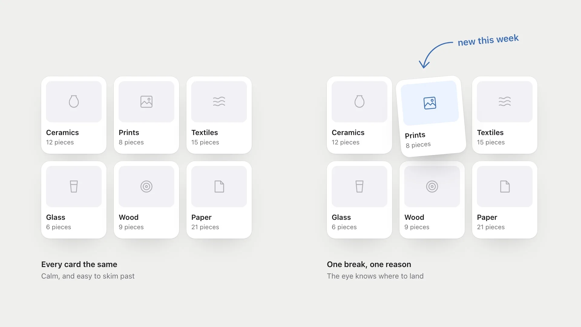
Asymmetry. A perfectly balanced layout is calm, and also easy to skim past. Breaking the grid once, on purpose, tells the eye where to look. The rule is to break it in one place, for one reason. An irregularity only stands out against a background of regularity, so the grid has to be strong for the break to mean anything.
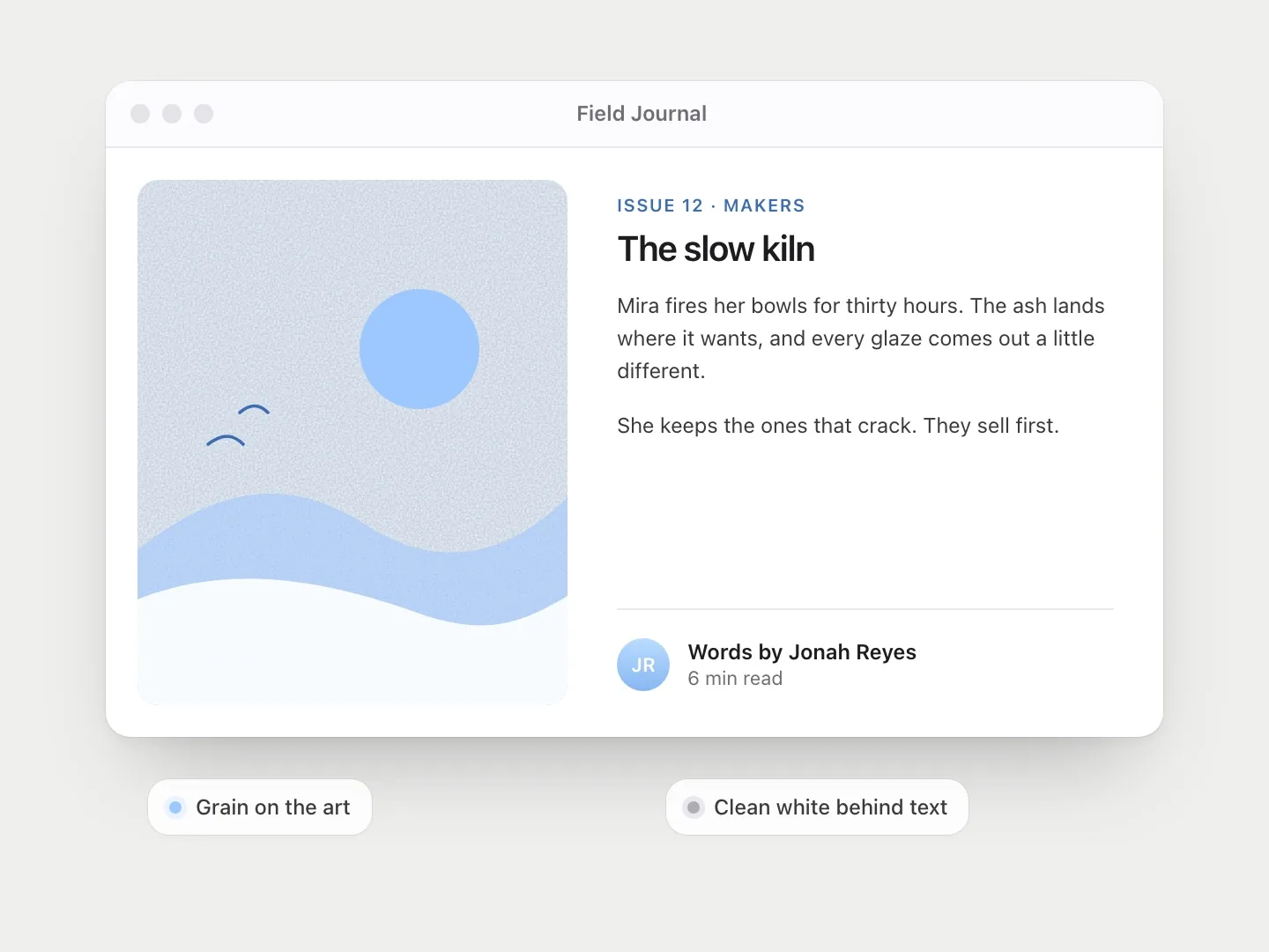
Texture. Grain, paper, hand-drawn marks, a slightly imperfect stroke. Texture makes a flat screen feel like a material, and it can carry a brand more strongly than a colour palette. It needs restraint, though. Texture behind text quickly hurts readability.
Personality. Copy that sounds like a person, an illustration with a point of view, a small animation that does something unexpected. This is the hardest to get right, because personality that’s forced is worse than none, and because it’s the kind most dependent on the product already being competent.
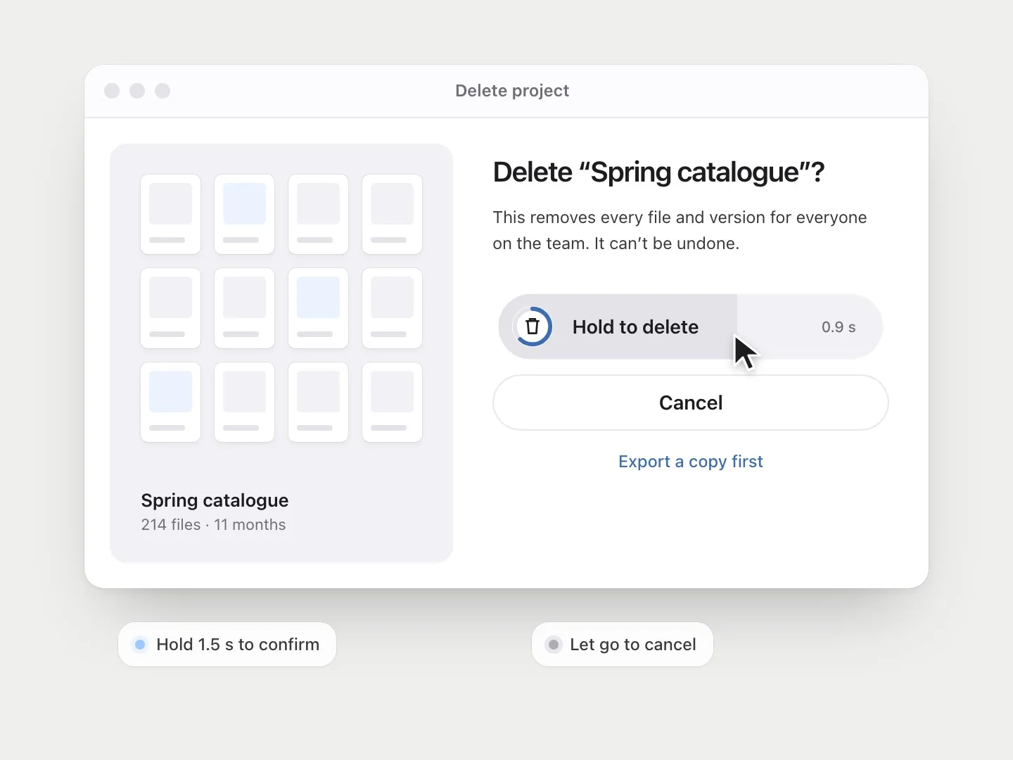
Chosen friction. Most friction should be removed. But some actions deserve a pause: confirming a big payment, deleting a year of work, sending a message you wrote while angry. A moment of friction there isn’t a usability failure. It’s care.
When difficulty helps, and when it doesn’t
Memory researchers talk about desirable difficulties: obstacles that make learning feel slower but make it last. Robert and Elizabeth Bjork, who introduced the idea, are careful about the word “desirable”. A difficulty helps when it triggers the kind of processing that builds memory, like having to generate an answer rather than being shown it. If the learner doesn’t have what they need to respond to it successfully, the same difficulty just becomes an obstacle.
The cautionary tale is fonts. A 2011 study by Connor Diemand-Yauman and colleagues found that material printed in harder-to-read fonts was remembered better, both in the lab and in high school classrooms. It was widely shared, including by designers. Later work by Ralf Rummer and colleagues found no effect of disfluent fonts on learning. A related and even more famous claim, that hard-to-read fonts make people reason more carefully, fell apart when Andrew Meyer and colleagues pooled the original experiment with 16 attempts to replicate it. Ugly fonts made people slightly slower, and that was all.
I think the reason is instructive. Squinting at letters is effort spent on perception, not on meaning. It makes the experience harder without making the thinking any deeper. The difficulty that helps lives in the content, in the decision someone has to make or the thing they have to produce, not in the surface they have to fight to see it.
The IKEA effect makes a similar point from another angle. Michael Norton and colleagues found that people valued things they had assembled themselves, like flat-pack boxes, origami and Lego, more than identical things they hadn’t, even seeing their amateur results as comparable to an expert’s. But the effect disappeared when people failed to finish, or when they built something and then had to take it apart. Effort created value only when it ended in a completed thing.
For product design, that suggests a simple test for friction. A small, meaningful action that ends in something the person made, chose or understood can make an experience stick. Friction that just slows people down, or that they abandon halfway through, buys nothing.
Remove the friction that wastes people’s time. Keep the friction that respects their decisions.
How to tell a feature from a flaw
The difference between useful imperfection and bad design is intention and placement. Some tests I use:
- Can I say why it’s there? If the only answer is “it looks interesting”, it’s decoration.
- Are the conventions intact? Navigation, hierarchy and controls should stay typical. Character belongs in the layers that don’t carry learned behaviour.
- Does it get in the way of a core task? Irregularity belongs in the moments of character, not in the checkout form.
- Is the product competent first? Personality on top of something that works feels human. On top of something that doesn’t, it feels careless.
- Does it stay accessible? Contrast, legibility, focus states and screen reader output should never pay for personality.
- Is it rare? One broken grid is a choice. Ten is a mess.
Leaving fingerprints
As AI tools make polished, pattern-perfect interfaces quicker to produce, I think the human marks will matter more, not less. Perfect execution will be easy to get. A point of view won’t.
The goal isn’t to make products messy. It’s to keep the parts people rely on familiar, and leave a few fingerprints, in places you’ve chosen, so people can tell someone actually made this.
References
10
- Aronson, E., Willerman, B. & Floyd, J. (1966). The effect of a pratfall on increasing interpersonal attractiveness. Psychonomic Science, 4(6), 227–228. doi.org/10.3758/BF03342263
- Bjork, R. A. & Bjork, E. L. (2020). Desirable difficulties in theory and practice. Journal of Applied Research in Memory and Cognition, 9(4), 475–479. doi.org/10.1016/j.jarmac.2020.09.003
- Diemand-Yauman, C., Oppenheimer, D. M. & Vaughan, E. B. (2011). Fortune favors the bold (and the italicized): Effects of disfluency on educational outcomes. Cognition, 118(1), 111–115. doi.org/10.1016/j.cognition.2010.09.012
- Fuchs, C., Schreier, M. & van Osselaer, S. M. J. (2015). The handmade effect: What’s love got to do with it? Journal of Marketing, 79(2), 98–110. doi.org/10.1509/jm.14.0018
- Hekkert, P., Snelders, D. & van Wieringen, P. C. W. (2003). ‘Most advanced, yet acceptable’: Typicality and novelty as joint predictors of aesthetic preference in industrial design. British Journal of Psychology, 94(1), 111–124. doi.org/10.1348/000712603762842147
- Helmreich, R., Aronson, E. & LeFan, J. (1970). To err is humanizing sometimes: Effects of self-esteem, competence, and a pratfall on interpersonal attraction. Journal of Personality and Social Psychology, 16(2), 259–264. doi.org/10.1037/h0029848
- Meyer, A., Frederick, S., Burnham, T. C., Guevara Pinto, J. D., Boyer, T. W., Ball, L. J., Pennycook, G., Ackerman, R., Thompson, V. A. & Schuldt, J. P. (2015). Disfluent fonts don’t help people solve math problems. Journal of Experimental Psychology: General, 144(2), e16–e30. doi.org/10.1037/xge0000049
- Norton, M. I., Mochon, D. & Ariely, D. (2012). The IKEA effect: When labor leads to love. Journal of Consumer Psychology, 22(3), 453–460. doi.org/10.1016/j.jcps.2011.08.002
- Rummer, R., Schweppe, J. & Schwede, A. (2016). Fortune is fickle: Null-effects of disfluency on learning outcomes. Metacognition and Learning, 11(1), 57–70. doi.org/10.1007/s11409-015-9151-5
- Tuch, A. N., Presslaber, E. E., Stöcklin, M., Opwis, K. & Bargas-Avila, J. A. (2012). The role of visual complexity and prototypicality regarding first impression of websites: Working towards understanding aesthetic judgments. International Journal of Human-Computer Studies, 70(11), 794–811. doi.org/10.1016/j.ijhcs.2012.06.003